SpotHero’s App Redesign
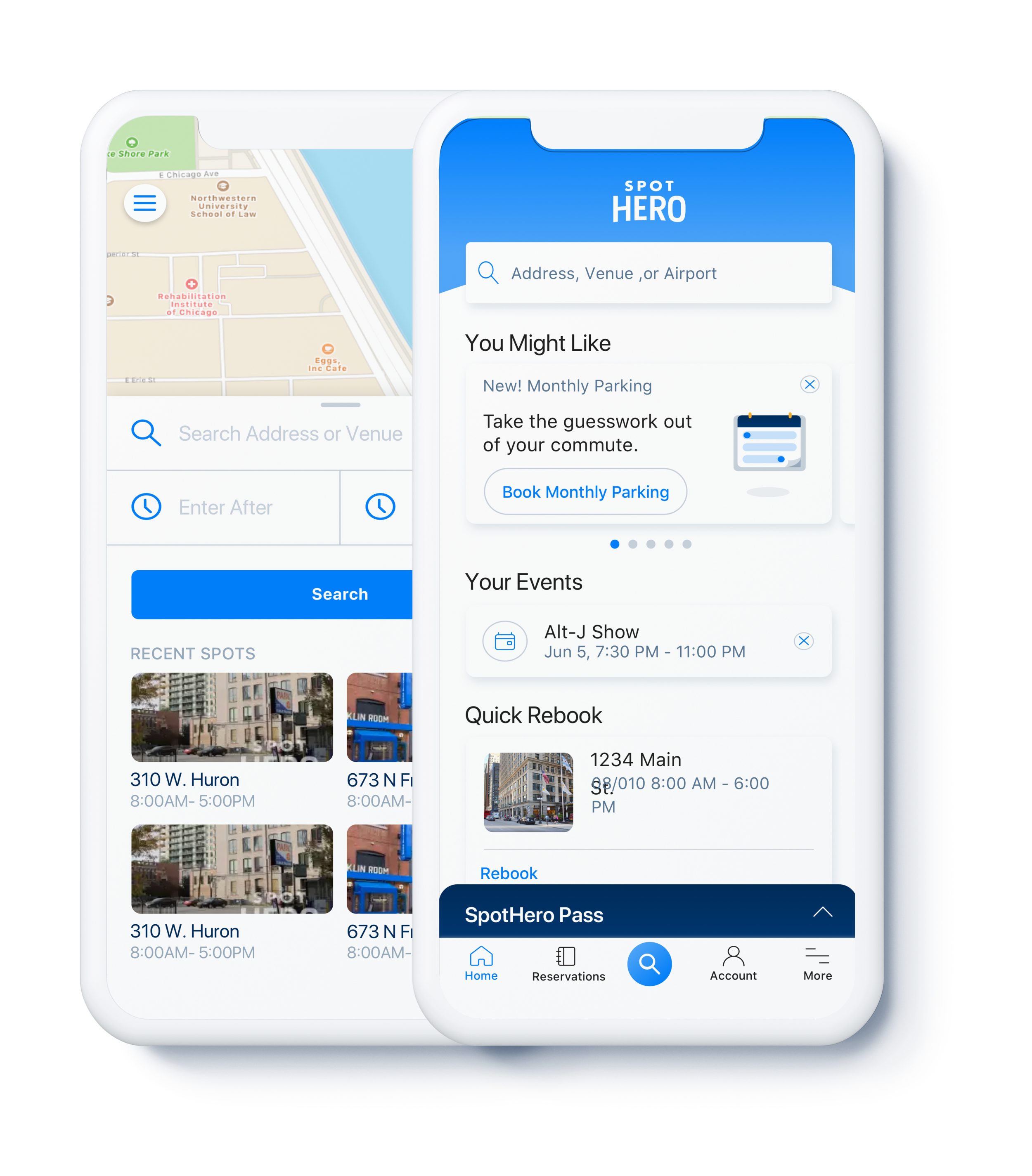
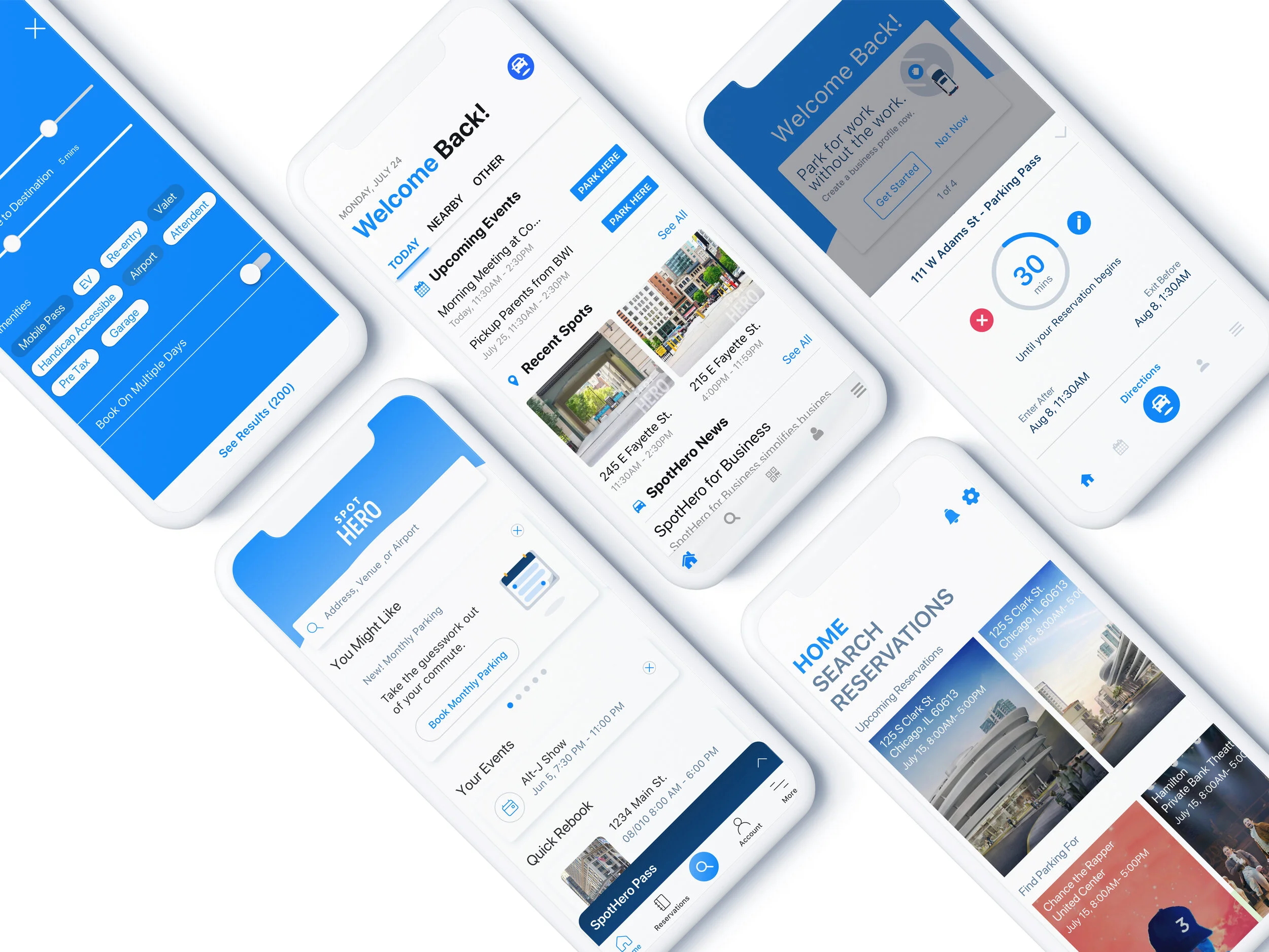
In 2017, we, at SpotHero, started expanding our parking features for specific archetypes, and found our existing information architecture restricting our ability to expand. We took the opportunity to not only redesign the information architecture, but also the look and feel. This redesign set us up for future customizations as well as speedy design mocks with a fresh design system.
Focus: Brand & UI design, Information Architecture,
Year: 2018
My Role: Director of UX & Product Design
Credits to: Lead Designer - Austin Tapper, Product Designers -JJ Lee & Battsengel Lopez, Product Manager - Jenny Wanger
The Goal
The SpotHero app was starting to grow, adding features created for specific drivers. We added: SpotHero for Business, to split your personal and work related parking expenses; Calendar Sync, to quickly find parking near your events at the times of your events; Commuter Benefits, so you can pay for parking with your tax free savings; and Power Booking, so you can book your parking for work all week in one click. We realized, that our old information architecture was no longer able to handle the load, and prevented us from creating a custom experience for each drivers’ needs.
Customizable
Are you a commuter going to the same place 5 times a week? Or do you mostly drive to just concerts or shows? Our new information architecture must have the ability to show which features are most relevant to each user.
Quick
90%+ of our drivers booked parking within 5 min of their start time, so we need to ensure we didn’t put up too many roadblocks.
Educational
Beyond not allowing for customization, our current app left little room to hold our new users’ hands as they experience us for the first time, so the new information architecture must allow for this.
Customizable
We wanted to build an architecture that would allow us to experiment with different feature without requiring a full app redesign for each feature. These features at the time where only hypotheses, but focused on commuters and overall personalization, thus improving retention and life time value as well as partnerships.
To not get stuck in the weeds, we prioritized our hypothesized jobs to be done by potential to impact to our company goals. These helped us test out different IAs.
UI Update
As a secondary focus, we saw this as an opportunity to update our visual design system and pattern library to improve consistency and speed up future development. Additionally, we hadn’t established a design system, and a year earlier rolled out a new brand that we haven’t taken advantage of in our product design. So we aligned on our visual language with the brand team over several mood board explorations focused on our existing brand logo and elements done the previous year.
We aligned on:
Our brand blue & white as our primary colors for a clean airy layout to improve reading speed
Bolder headlines to improve reading
Rounded elements to mimic the arc in our logo and our car icon
A hero cape arc to echo the curve in our logo type.
Iteration
With an open highway of possibilities, we set out with 4 designers each creating 2 to 3 concepts including both option for our new IA and our new UI style.
Design sprint style, we continued to iterate until we diverged towards one direction.
Given that:
1. this redesign was a major change in IA and UI for our users, and
2. one of our main goals was to design for speed,
We needed to test with our loyal users who were used to our old app
Could they use this new app design, and quickly?
Usability Testing
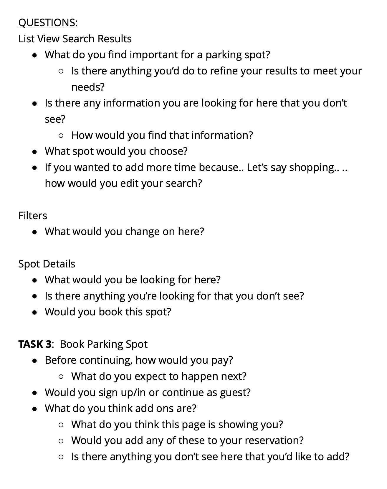
Example of moderation guide for interview / usability test combo.
The Rollout
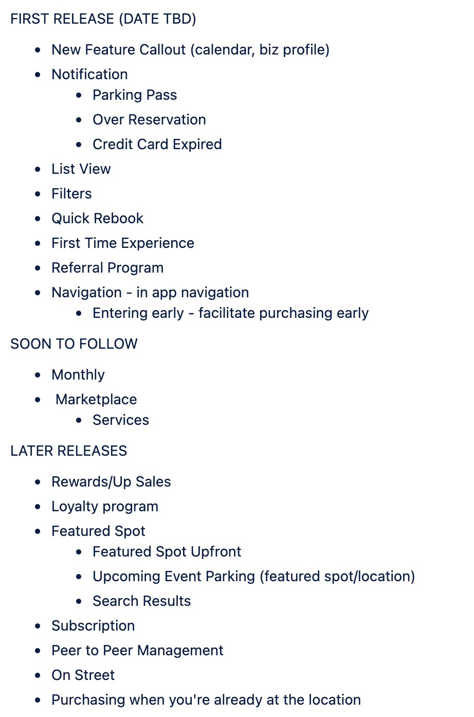
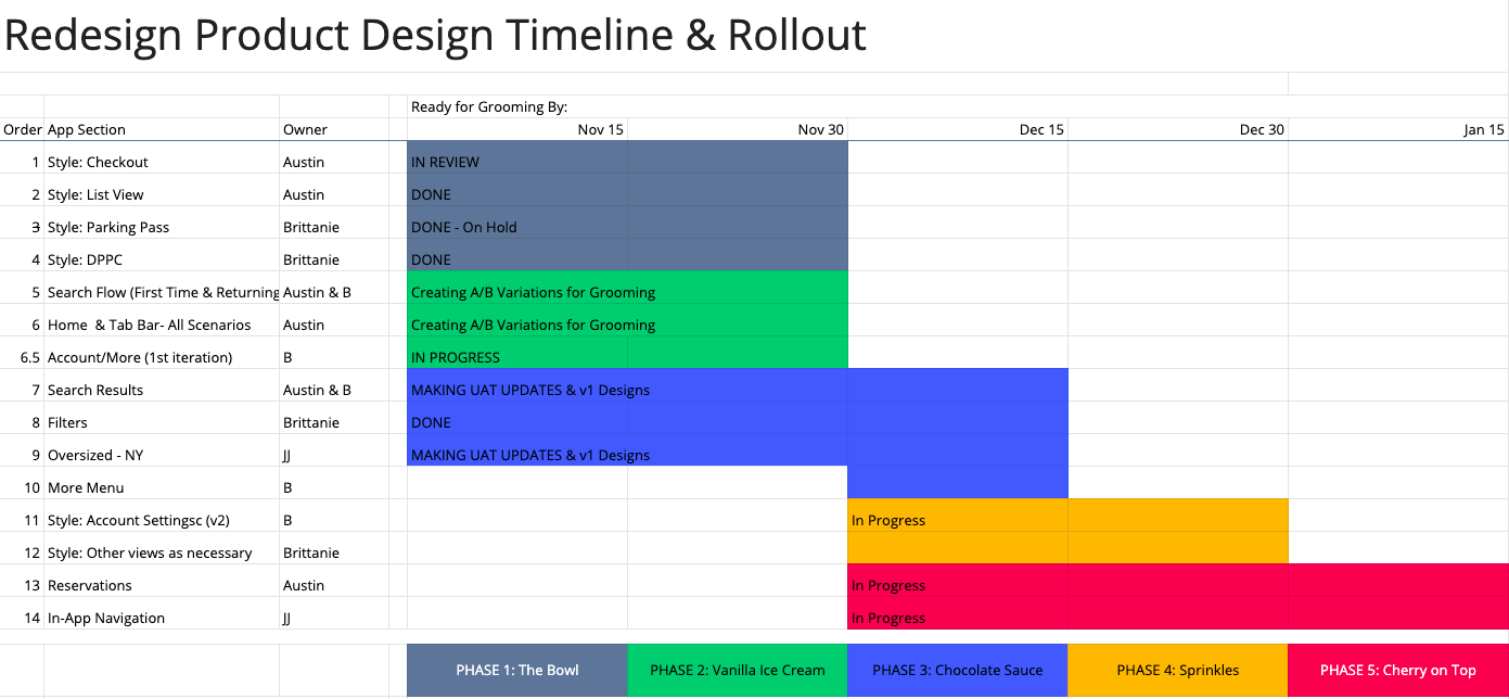
We needed to rollout this new design in chunks so we could test it before we jumped full in. It was important to get it out without waiting for the prefect design to uncover as many issues as soon as possible. Working with the Product Manager and Mobile Engineering Manager, we created a phased rollout.
A Walkthrough of the SpotHero iOS App
Note: This may already be out of date, and shows how we didn’t do a mass update to the app all at once, but only updated areas at a time so we could test, learn and optimize.
Success
We already had a good sense from a tweak in our iOS app, that asking for location, times up front was a safe call, but with our new app design we confirmed it.
We reduced contacts from customers who accidentally booked the wrong time, while keeping our conversion on par with the previous design.
From here we have the ground work, and been iterating on features and our home screen to provide more value to each user while increasing conversion through A/B tests.
Download the SpotHero app to see the latest!

